The Ultimate Guide to ADA-Compliant Parking Lots
BY AsphaltPro Staff
More than 25 years after the birth of the ADA, compliance with the law can still be confusing. Here’s how to stripe a lot that meets ADA requirements and local codes to keep your lots compliant and your customers out of the courthouse.
In 1990, Congress passed the Americans With Disabilities Act. Similar to the Civil Rights Act of 1964, which made discrimination based on race, religion, sex, national origin and other characteristics illegal, the ADA afforded people with disabilities protection from discrimination based on their disabilities.
Unlike the Civil Rights Act, the ADA also began requiring employers to provide reasonable accommodations to employees with disabilities and required all public accommodations to meet certain accessibility requirements.
Despite the law being more than 25 years old, there is still some confusion as to what is required and by whom. And it affects you, pavement contractors, who must make sure the lots you pave and stripe comply with the law.
 ADA-Compliant Versus Code-Compliant
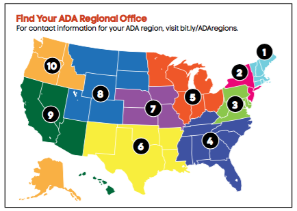
Oftentimes, people use the phrase “ADA-compliant” when what they really mean is building code compliant. The ADA’s accessibility requirements are a set of federal standards that must be met nationwide. But each state and even municipalities has the right to set requirements above and beyond the 2010 ADA Standards for Accessible Design, the current guiding document. That means an ADA-compliant parking lot might still be out of local compliance and subject to complaints, fines and even lawsuits.
 Some states, like California, have extensive additional requirements for accessible parking lots. Other states may have very few. For this reason, compliant accessible parking in Missouri might look nothing like compliant parking in New York or California.
For example, signage in Florida should read, “Parking By Disabled Permit Only,” but should say “Permit Parking Only—Tow Away Zone” in Georgia and “Handicapped Parking—Permit Required” in Pennsylvania. Many states prohibit the use of the word “handicapped” on signage entirely.
According to Julie Brinkhoff, project director at the Great Plains ADA Center, the best option for contractors looking to fulfill state and local requirements is to check your state’s building code and ask local code enforcement officials. But some states may not have a state building code. For example, Missouri outlines its additional requirements in the state parking code.
Another option is to call your local pavement marking distributor. For example, Titan Tool, based in Plymouth, Minnesota, provides select ADA-compliant stencils through pavement marking distributors, according to Tom Heine, Titan markings division sales manager. He also recommends thoroughly investigating your state’s accessibility specifications.
“This will increase your overall knowledge within the category,” Heine said. “It will also ensure compliance and earn the trust of your customer.”
For Calvin Bell, owner of Pavement Stencil Company in Roanoke, Virginia, maintaining up-to-date requirements for all states and municipalities is a constant battle.
“We try to keep up with state regulations, but we may put together a perfectly updated list and it could be out of date just two months later,” Bell said. “So, we also rely on the customer to know what they need.”
With 26 years in the business, Bell has noticed the confusion surrounding ADA compliance. “Folks don’t realize that some of the specs aren’t an ADA issue, but may be a state or municipal issue,” he said. “You really need to know your local standards to make sure what you’re doing is correct.”
 Bell said his company can create any stencil the customer may want, but the most common stencil—used by around 90 percent of Pavement Stencil Co.’s customers—is a 39-inch international symbol of accessibility. But even with the international symbol, there are exceptions. For example, Florida requires a larger symbol in some areas.
Beyond that, because there are so many different versions of the international symbol, they may look the same at 39 or 42 inches, which covers most municipalities, but if you dig deeper and compare them, Bell said the differences are very noticeable. “There’s no hard and fast drawing of these things,” he said. “There was an original, but it’s been altered so many times at this point, it’s not at all the same.”
Some states have even deviated from the International Symbol of Access entirely, opting for a more active accessible icon. In this icon, the traditional accessibility icon includes a person leaning forward in the wheelchair as if he is racing.
Pavement Stencil Co. might have been the first pavement stencil company to create a stencil of the active accessibility icon for commercial contractors’ use. In 2012, the company worked with the designers of the active icon to get their first stencil just right. Now, they get requests for stencils of this new symbol from New York, Pennsylvania, Massachusetts and North Carolina. For more information on this icon, read the sidebar accompanying this article.
What Makes a Parking Lot ADA Compliant?
Current ADA standards are outlined in the 2010 ADA Standards for Accessible Design, and all physical construction and alterations are now subject to these requirements. Here are some of the key points related to ADA-compliant parking lots.
Accessible parking should be located at the shortest acceptable route to the building. This might not necessarily mean the parking spaces physically closest to the building, but rather the spaces that offer the easiest access to the building entrance.
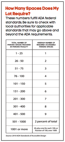
For a parking lot with fewer than 25 spaces, at least one space—even if the lot only has one space—must be accessible. For every additional 25 spaces, one more accessible space is required. For lots with 501 to 1,000 spaces, accessible spaces should make up 2 percent of the total. For lots with 1,001 spaces or more, 20 spaces need to be accessible, plus one for each 100 spaces (or fraction of 100 spaces) beyond 1,000. These numbers are determined lot by lot, so even if there are three separate parking lots on one site, each lot is considered individually.
At least one of every six accessible parking spaces needs to be van-accessible. If your client’s lot only requires one accessible parking space, it must be van-accessible.
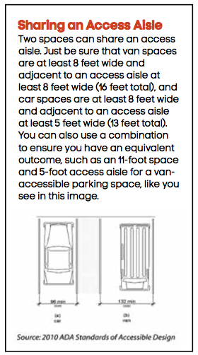
A van-accessible space must be 8 feet wide and adjacent to an 8-foot access aisle for a total of 16 feet. A car-accessible space must be a minimum of 8 feet wide, as measured from the middle of each boundary stripe and will require an access aisle of at least 5 feet, for a total width of 13 feet. You can also use a combination to ensure you have an equivalent outcome, such as an 11-foot space and 5-foot access aisle for a van-accessible parking space. Access aisles also need to extend the full length of the parking space.
Access aisles can also be shared between two spaces. For example, an 8-foot access aisle can accommodate two van-accessible parking spots—one on each side of the aisle. An exception is for angled van parking, where the access aisle should be located on the passenger side of the parking space. To be as considerate as possible, the ADA standards suggest that, if one access aisle is shared by a van-accessible and a car-accessible space, that the van space be positioned so the access aisle is available on the passenger side. All access aisles should be marked in a way that “discourages parking” in that area.
Parking surfaces within the accessible spaces and access aisles must be firm, stable and slip-resistant, and include no changes in level. Up to a 1:48-inch slope is acceptable, but the ADA suggests checking the slope of multiple spaces to ensure you meet this requirement.
Ideally, each access aisle would connect directly to a standard curb ramp leading onto the sidewalk or entranceway of the building, though not required. It’s also encouraged not to have accessible routes that lead behind vehicles. But if the parking lot requires such a path, the pedestrian route also has to be marked with contrasting paint.
The ADA doesn’t specify what color of paint to use, but does require you to use a paint that contrasts from the parking surface. Some states and municipalities might require specific colors, like blue or yellow, or even a particular shade of a color. ADA guidelines also don’t enforce a specific width of the parking stripes.
It’s also required that each accessible parking space be marked with appropriate signage, with one sign per accessible space. Every sign should include the international symbol of accessibility, and van spaces also require a van-accessible sign. The sign needs to be 5 feet above the surface of the marking space, including the height of the curb.
In lots with fewer than four total parking spaces, identification of the accessible space isn’t required. For residential facilities where parking spaces are assigned to specific residences, identification of accessible spaces is also not required.
Another feature often included is the international symbol for accessibility painted within the parking space. ADA guidelines only require this symbol on the sign, but many states do require it to be painted within the parking space, as well.
Parking spaces should also be designed so cars parked in the spaces can’t “protrude into the accessible route,” making it more difficult for individuals using those routes to pass through. The ADA suggests the use of parking stoppers to solve this potential issue.
It’s also important to note that some parking areas are exempt from these rules, including spaces used exclusively for buses, trucks and other delivery vehicles, law enforcement vehicles or vehicle impound.
There are also some situations in which the ADA has set different standards. For example, at least 10 percent of patient and visitor parking at hospital outpatient facilities should be accessible. For rehabilitation and outpatient physical therapy facilities, that number increases to 20 percent.
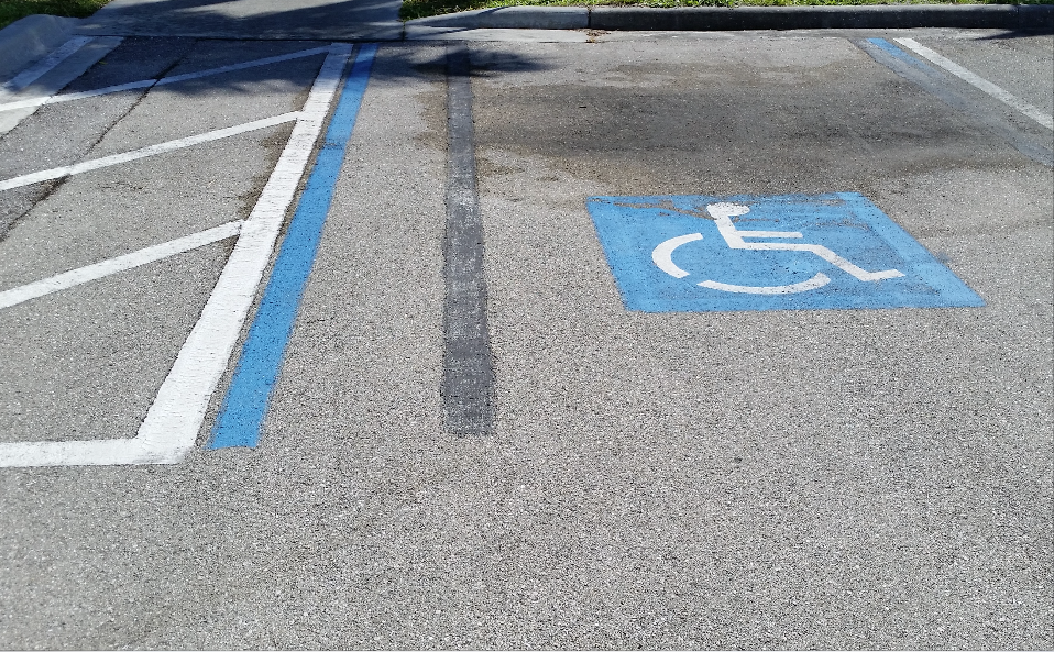
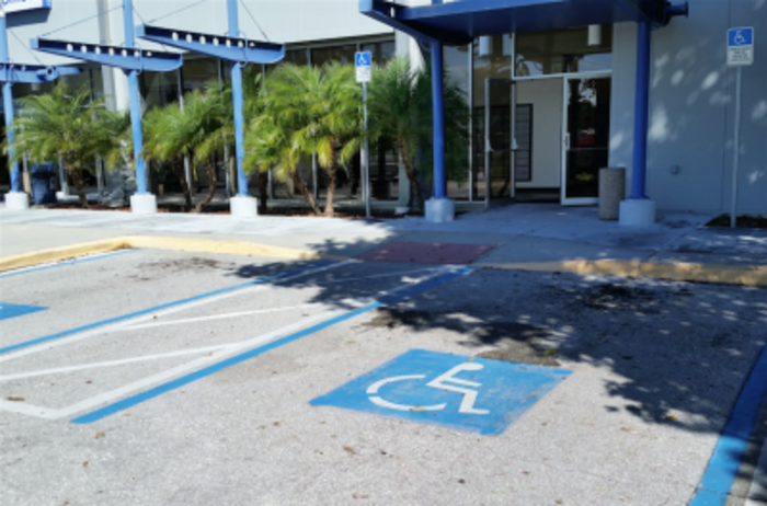
At a post office in southwest Florida, you can see where the team had to re-lay out the row of parking spaces to accommodate the increased number of ADA spaces required for the size of lot this business has. When the crew has to restripe for any reason, the use of black paint or sealer can cover the old markings, or someone may need to use a pavement scarifier to grind paint off the surface.
The Striping Process
No matter what your state and local regulations might be, it’s important to do your research and ensure you only have to do the job once.
“It’s along the same lines of best practice for carpentry, ‘Measure twice, cut once,” Heine said. “Following the blue prints or specification documents is rule no. 1 when it comes to pavement marking.”
In the case that a striping contractor does make a mistake painting an accessibility-compliant parking lot, there are ways to remove the paint, from products to remove the paint to grinding it off or painting the entire pavement black and restriping, but the best option is to get it right the first time by thoroughly reviewing the 2010 ADA standards and checking with local code enforcement officials.
“All the options to re-do the lots are expensive and take up time,” Bell said. “Make sure it’s right before you put it down.”
Complaint striping can be done using standard paint, thermoplastic and MethalMethacralate coating applications, each of which “have excellent benefits within their respective segments,” Heine said. “Using paint—cold applied—is quick, easy and very effective in most applications, but requires more upkeep as it typically wears faster (when applied at 15 to 20 mils) than thermoplastic and MMA markings,” Heine said. “Thermoplastic—hot applied—requires a little more expertise and patience, goes on thicker (90 mils on average) and is great for high-traffic areas, like crosswalks, stop bars and intersections.
“MMA—cold applied—is another excellent coating/technology that is hitting the streets in most major markets,” Heine continued. “This coating is ‘bullet proof’ 110 mph NHL-slap-shot-tested (it’s the main component in the ‘plexi-glass’ you see in hockey arenas).” It averages 30 to 60 mils thick and works well in high traffic areas, like crosswalks, stop bars and intersection work, Heine said.
Ennis-Flint, based in Thomasville, North Carolina, produces 4-inch-wide linear blue preformed thermoplastics often used in accessibility striping, as well as accessibility markings. Its standard accessibility marking is a 40-inch blue square with a white international accessibility symbol inside, but is also available in a variety of sizes. The company also makes a preformed thermoplastic with truncated domes on the surface to help people with visual impairments recognize the boundary between vehicle and pedestrian areas.
“Our standard offering is based on Federal Highway Administration designs,” Zina Brooks, vice president of marketing and customer support for Ennis-Flint, said. “However, we can manufacture specific sizes.”
Pavement Stencil Co. offers accessibility stencils for painting, which are made of plastic, and thermoplastics, which are made of aluminum.
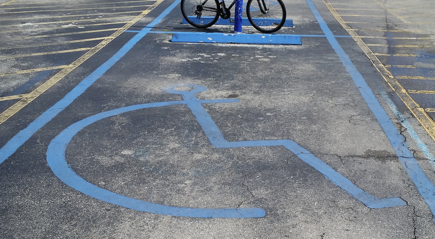
The striping crew needs to have proper stencils on the truck before heading out to the job. This example of a accessible parking stall in a Southwest Florida parking lot might get the point across, but it is not in compliance with Lee County codes. You can bet this parking lot did not pass inspection. A striping crew will have to cover these markings with either black paint or sealer to “hide” them before painting the appropriate markings to bring the parking lot up to code. That means not only a call-back on the job, but additional materials that probably weren’t included in the original bid. This is wasted time and additional product that comes out of the striping contractor’s pocket. Photo courtesy of Sandy Lender.
What About the Money, Honey?
It’s also worth mentioning to prospective clients that a special tax credit of up to $5,000 per year is available to help smaller employers make accommodations required by the ADA. Any business can also take a full tax deduction of up to $15,000 per year for expenses of removing qualified architectural or transformational barriers.
 It’s also important to make sure responsibilities to meet ADA and local requirements are outlined in the contract. Note who will be held financially responsible for restriping in the event that requirements aren’t met—the client, the contractor, or the subcontractor.
“It’s not always the case 100 percent of the time, but if the striping contractor doesn’t perform his or her duties to ADA/local code specification and/or their customer’s specifications, he or she will usually be held responsible for correcting the work,” Heine said.
If a parking lot doesn’t meet requirements, the business owner could be required to repair it, pay a fine, and could even be sued. Enforcement of accessible parking requirements is administered by a variety of agencies, depending on state and municipality.
A complaint can only be made to the U.S. Department of Justice if the lot doesn’t fulfill federal ADA requirements. Otherwise, the complaint will be made at the local or state level.
“Some people choose just to tell the business owner directly,” Brinkhoff said. “Others might file a grievance with the local authorities, or take it to the state human rights commission.”
It’s also worth knowing that small businesses have limited protection from lawsuits. Except with respect to new construction and alterations, no lawsuit can be filed regarding acts occurring prior to July 26, 1992, by businesses with 25 or fewer employees and gross receipts of less than $1,000,000, or Jan. 26, 1993, by businesses with fewer than 10 employees and gross receipts less than $500,000.
Ultimately, Bell said, it’s important to run each and every requirement by the customer and give them the final say. But the most important factor?
“Don’t forget what we’re doing this job for—to make things more accessible to everyone,” Bell said. “You have to think from the perspective of the people that need these markings. Keep the end result in mind and make sure you’re remembering that bottom line.”
A More Active Symbol of Access
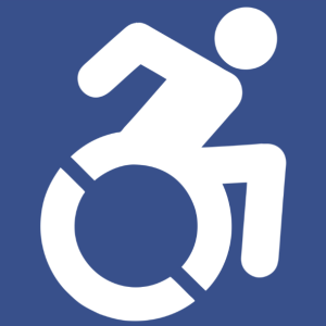
The Accessibility Project’s symbol of access utilizes angles to imply motion.
The International Symbol of Access isn’t so international anymore.
Some states and municipalities have opted instead for a new standard symbol of access—a more active symbol of access.
The first state to adopt the new symbol was New York in 2014, but the search for a new symbol began in 2010 when artist Sara Hendren started collecting images of accessibility icons she felt represented persons with disabilities more accurately.
Along with Brian Glenney, she began to design a more active icon of accessibility, posting decals of their icon over existing access icons. By 2011, the current active icon was born. The new icon shows a person in a wheelchair, leaning forward as if in motion. Or, as Hendren calls it on the project’s website, the “italicized” version of the old accessibility symbol.
As their project gained momentum, people began asking Hendren and Glenney for a formal icon to replace the existing symbol. With the help of designer Tim Ferguson Sauder, the accessible icon and the Accessible Icon Project were born.
The final icon is white within a blue square. The head, arm and leg are positioned to imply motion, and the limbs are rounded rather than squared, as they are in the existing International Symbol of Access. The wheel has two cutouts, both to emphasize motion and make stenciling easier.
If you ask Hendren, she’ll tell you that the project is so much more than the symbol that has stamped and stenciled its way onto streets and signs in hundreds of cities and a handful of states. It’s an activism project that aims to change the way we think about people with disabilities.
Replace a Worldwide Standard
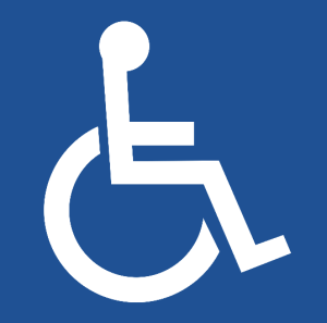
The current International Symbol of Access was designed in 1968.
The International Symbol of Access is one of many internationally recognized logos maintained by the International Organization of Standardization. Other symbols include symbols for explosive or poisonous materials, slippery floors and trip hazards. The purpose is, regardless of where you are in the world, you’ll have key information to stay safe. In fact, the International Symbol of Accessibility is probably one of the most recognized international symbols of all, due to its presence in nearly every place we go.
The symbol was chosen during a design contest in 1968. The winning symbol was created by Susanne Koefed, a Danish designer, and did not have a head. Within a decade, a head was added to the design and ISO and the United Nations adopted the logo. And in 1990, Congress passed the Americans With Disabilities Act.
As Slate reported in February 2014, “The presence of this single, attractive logo to signify a universal right for access helped create an atmosphere in which the world could begin to adapt to new building parameters and regulations. In many ways, the adoption of the international accessibility icon is a success story of a simple design changing the world for the better.”
To date, the Department of Justice, which enforces ADA specifications, has not made an official statement about whether or not the new symbol is considered equivalent facilitation.
The symbol is still up for debate with ISO, which claims it may not be representative of all disabilities of individuals in wheelchairs—particularly with the arm motion included in the active symbol—but Hendren and her collaborators attest that the icon is a symbol, not a literal representation. The goal is to encourage people to rethink disability.
The active accessibility icon is free and available to all on the public domain.

